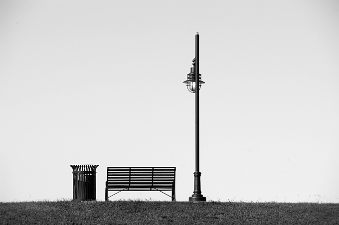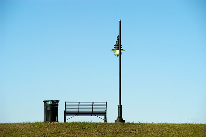
Okay, I’m on my couch in a slouched position reading a new book I just bought called, “Within The Frame” by David deChemin. For whatever reason I remembered this image from a year ago and wondered how it would look in B/W. I looked up the image then did a comparison in Lightroom, which he mentions in the book, between a color version and a B/W version, and is a powerful tool that needs to be used more often. Which one stirs the emotion in people is subjective, so both work. But there is more.

David has already helped me understand the difference between subject matter and the subject. We recognize the subject matter in both images: the trash can, bench and lamp post. But, the subject is the stark nakedness of the scene. Does seeing it in B/W accentuate the simple nakedness or not? Do we spend too much time assessing the blue sky or the grass color rather than feeling the subject. So I’m asking, which works better for you and why? Excuse me, I have more reading to do. 🙂
One Comment
QPB
I prefer the black and white here–I think it accentuates the starkness of the shot, the emptiness of the bench as well as the negative space.