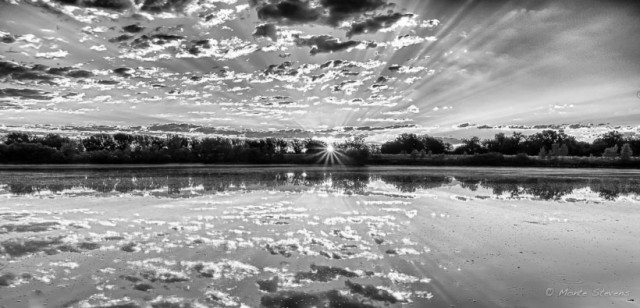
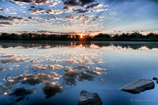
All of us at times go back and work on images with the intent of improving or learning something new. A couple days ago I converted an image to black and white because of an article I’d read. This is a second image I worked on. It is an HDR image. I’ve cropped the rocks out and run it through Silver Efex Pro 2. When finished I asked a couple of friends which one they liked. One immediately jumped all over the color version while the second one took time to study them, choosing the black and white version. It was at that moment I realized it was unnecessary to compare. Each version would stand on its own. Each will be liked or dislike for a thousand reasons. There was no need to compare.


8 Comments
John
>>There was no need to compare.
And yet you posted both for easy comparison
They are indeed both nice pictures. My immediate preference was for the color, but the black and white is also very nice too. In either case, it is a wonderful image with the sunbeams from the sun itself and in the sky.
Monte Stevens
Yes, I posted both as my intent was to ask what people which one they preferred. Depending on my mood will also determine which image strikes my fancy.
Paul
It’s hard to choose, but I prefer the color ONLY because of the rocks in the foreground. Both are beautiful
Monte Stevens
Thanks, Paul. When I shot the image the rocks were of interest to tme. When I worked on this image later they were not as appealing to me. The starburst was calling me this time.
Mark
You are right, there is no need to compare, though I really, really like the B&W version.
Monte Stevens
Thank you, Mark. Each one will appeal to us at different times and for different reasons.
Cedric Canard
For my own work there is only ever one version of an image, either B&W or colour, whatever the image dictates. But for other people’s work I don’t mind seeing multiple versions, even different crops. Having said that I often have a hard time choosing (I’m not a fan of choice ). In this case I have no preference. I like the cool, bluish tones and composition of the colour one and I like the clarity and sense of grandeur offered by the cinematographically composed B&W image.
Monte Stevens
One of my character defects is letting choices/decisions slide by thinking they will take care of themselves, then living with the result. This simple exercise allowed me to see the differences in how I could compose the scene prior to pressing the shutter. Two things appeal to me with the black and white image: 1) the panoramic composition and 2) as you mention, the clarity of the image. Thanks, Cedric. I always look forward to your comments!