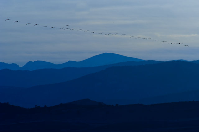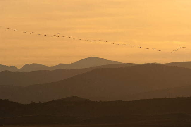
Playing with Lightroom to see what I can come up with. My post processing workflow has been simple, curves, contrast and sharpening. Tweaking with colors is not something I do very often. The other night I thought of this image and seeing what I could come up with in Lightroom with color changes. The image below is the original. What do you think?

6 Comments
Paul
Either way is nice, but I really love the cool blue one. It just seems nice, calming, and placid.
Monte Stevens
Yes, I agree the cool blue is more inviting to me. It’s amazing how much different they feel.
Steve Skinner
I find the blue image much more interesting.
Monte Stevens
Thanks, Steve!
Mark
I also like the blue Monte. I have a hard time verbalizing why. Yes, I agree more inviting. Perhaps it is because it is a more subdued tone overall and allows you to get absorbed in the details more than the strong power of yellow.
Monte Stevens
I hadn’t thought of the details being stronger in the blue image. The image was taken on a cool January evening but with strong warm colors. The blue image describes the season more appropriately. Hope you have great weekend!